Image
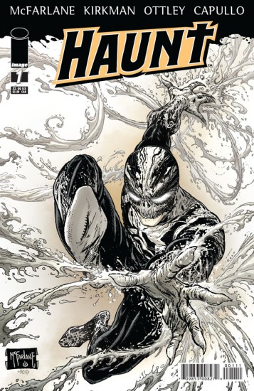
Writer: Robert Kirkman
Pencils: Ryan Ottley, Greg Capullo (layouts)
Inks: Todd McFarlane
Colours: FCO Plascencia
When Grant Morrison described his early creation Zenith as a reaction to torment superheroes, he could easily have been implicating Haunt, a new series from Images that is utterly joyless, humourless and devoid of that sense of magic and optimism present in all of the best superhero tales. You yearn for someone to crack a smile or a joke, just to break the adolescent angst which practically drips from each page.
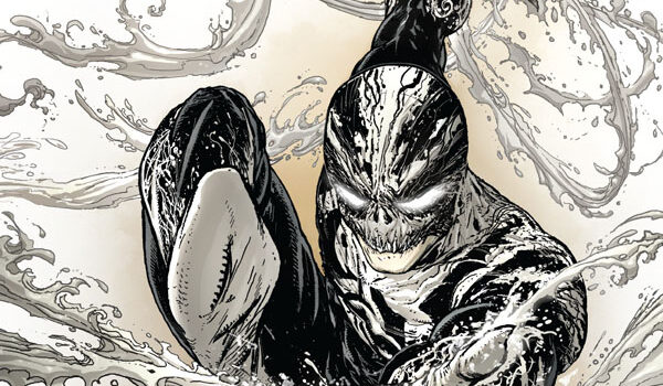
The series concerns two brothers: Daniel is a bitter, chain-smoking priest who frequents prostitutes and pretty much hates the world and everyone in it. Daniel is a Nick Fury-esque secret agent and conflicted killer. I won’t say much more, for risk of spoiling a key plot twist in this issue, other than that the two brothers are capable of merging into one entity, a black and white Carnage aspirant presumably named Haunt.
Despite Todd McFarlane being touted as the lead talent here, Haunt is actually written by co-creator Robert Kirkman, which can only be a good thing. But those expecting something on par with The Walking Dead or Invincible will be disappointed; Haunt is the sort of title that Image Comics were infamous for churning out in the 90s. The plot is characteristically hurried, the protagonists impossible to emphasise with, and the glossy art devout of charm.
Ryan Ottley’s art here couldn’t be further removed from his work on Kirkman’s Invincible; but that’s probably because he’s following Greg Cappullo’s layouts and having his pencils subjected to McFarlane’s heavy, domineering inks. It’s still a slick, book, however, and will please many fans of the more typical Image material; even if the frequent violence is so gratuitously depicted it’s laughable.
There is still the opportunity for Haunt to improve. But from the first issue alone this series looks to be a waste of the talent involved… with the exception of Todd McFarlane, who has created yet another simplistic, confused property which will likely only improve when he’s cast it aside for fresh creators to renovate.
5/10
Leave a Reply